Vivaldi Color Analysis
- 3.7
- Rating
- 100.00K
- Installs
- Free
- Price

 Analysis by App-foxy
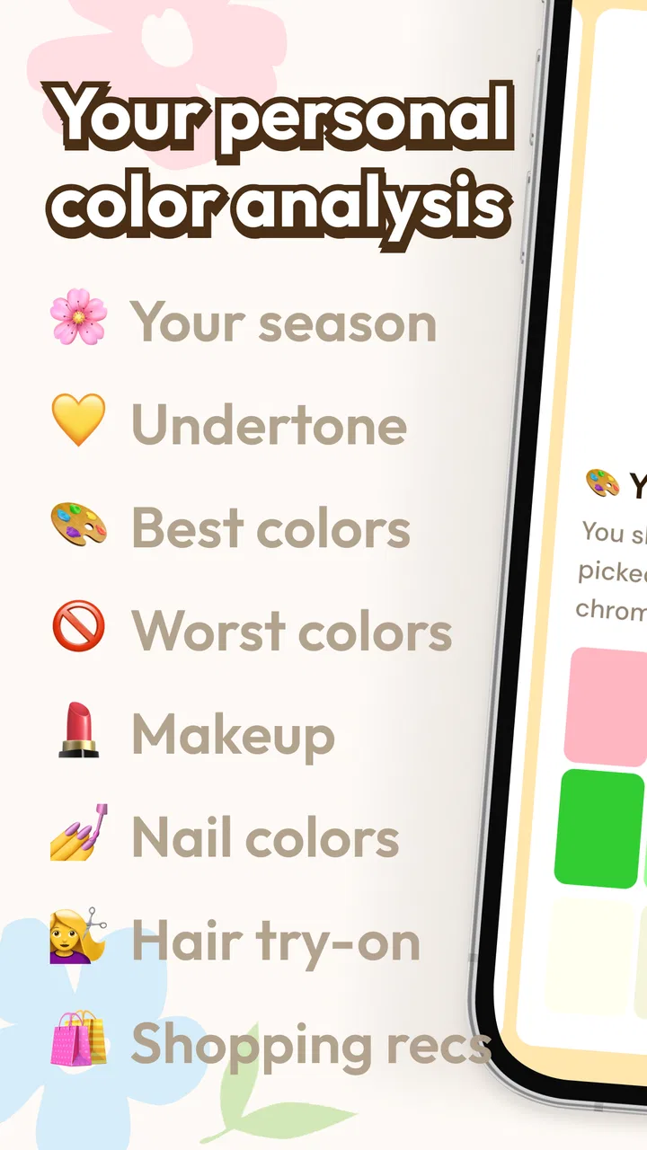
I approached Vivaldi Color Analysis as a practical beauty companion rather than a replacement for a professional color consultation. It is a free Android app from Јoy Studios that brings together AI color analysis, makeup try-on, digital drapes, a color quiz, and color matching. That combination makes it appealing if you want a quicker way to explore which shades may suit you before buying makeup or changing your wardrobe.
My first impression was that the app is aimed at curiosity and everyday decisions. You do not need to understand seasonal color theory before opening it. The useful part is being able to move from a general question—“Which colors work for me?”—to something more concrete, such as comparing a warm-looking lipstick with a cooler one or checking how a clothing shade changes the overall impression of a photo.
It is worth setting expectations correctly, though. AI-based color suggestions depend heavily on the image you use and the lighting around you. I would treat the results as guidance, not as an absolute rule. In that role, the app can be enjoyable and genuinely helpful, especially for someone who normally chooses colors by guesswork.
You May Also Like

 Blood Strike: 2.5 Anniversary
Blood Strike’s Loadouts Turn Every Drop Into a Tactical Gamble
A close look at Blood Strike’s custom loadouts: how fast access to signature weapons reshapes its battle royale rhythm, rewards preparation, and narrows the gap between fights.

 Pandora - Music & Podcasts
Pandora’s Music Is Easy to Start, but Harder to Recover
Pandora’s strength is its low-effort path from a seed to a station. Its weak spot is how much confidence it asks you to place in connection, setup, and quiet recovery.

 8 Ball Pool
 Is Built on Rivalries, Rematches, and Routine
A close look at the rivalries, rematches, shared routines, and unanswered safety questions that turn a quick pool match into a persistent mobile community.

 Samsung Music
’s Quiet Strength Is Playing What You Already Own
Its reach comes less from spectacle than from dependable access to a personal library. That simplicity is both the app’s strongest retention engine and its ceiling.

 AccuWeather: Weather Radar
AccuWeather Review: A Quick, Clear Forecast for Everyday Decisions
For everyday plans, the best forecast is the one you can understand quickly. AccuWeather makes rain timing, radar, and local conditions easy to act on, with a few trade-offs.

 Hill Climb Racing
Why Hill Climb Racing Still Turns Crashes Into One More Run
A tiny car, a bumpy hill and one more upgrade: Hill Climb Racing keeps resurfacing because its simple chaos makes every near-miss feel personal.
More From Our News Desk



Getting started without overthinking the analysis
The app is listed for Everyone and works on devices using Android 4.4 or later. It is free to install, which makes it easy to test without committing money at the beginning. The developer is Јoy Studios, and the current version is 1.0.0.9. Optional in-app purchases range from six dollars to twenty-four dollars per item, so I would explore the free experience first and only consider paying if the tools become part of your regular routine.
When starting a color analysis, the most important preparation is not technical. It is choosing a useful photo. A heavily filtered selfie, colored room lighting, or a strong beauty effect can push the analysis in the wrong direction. For a more dependable starting point, use a clear image with your face visible and avoid letting bright colored walls or dramatic lighting dominate the frame.
This is one of the app’s less obvious lessons: the quality of the input matters more than the novelty of the AI label. If you take several pictures under different conditions, you may notice that the result changes. That does not necessarily mean the app is broken; it shows why color analysis should be viewed as a comparison tool. Look for shades that appear consistently promising rather than treating one result as a permanent identity.
I also recommend removing the pressure to find a single perfect “season” immediately. The digital drapes are more useful when you compare families of colors side by side. A shade that looks attractive in isolation may make your complexion appear dull beside another option. Using the drapes as a visual experiment gives you more practical information than simply memorizing a label.
Turning the first result into something useful
A good first success is not discovering a definitive palette. It is finding one color decision you feel more confident about. For example, if you are choosing between two tops for a casual event, you can use the drapes and color matching tools to examine which direction feels more harmonious. Then compare that impression with your usual wardrobe instead of starting from an imaginary makeover.
The makeup try-on is particularly approachable for beginners because it lets you explore an idea before purchasing a product. I would use it to compare broad shade directions—such as softer versus stronger tones—rather than expecting it to reproduce the exact finish of a real cosmetic. Screen color, camera processing, and the texture of the eventual product all affect the final result.
That distinction matters when shopping. A virtual try-on can help narrow the field, but it cannot fully show how a formula will feel, how opaque it will be, or how it will change after several hours. I found the feature most valuable as a screening step: it can help you avoid obviously unsuitable color families, while the final decision still belongs to real-world testing.
The color quiz offers a different route into the app. It is useful if you are unsure how to begin with a photo or if you want to compare your instincts with the visual analysis. I would not use the quiz as a substitute for the drapes. The two approaches answer slightly different questions: one reflects your preferences and responses, while the other focuses more on visual matching.
A realistic everyday workflow
Imagine that I am getting ready for a friend’s birthday dinner and have a new outfit in a muted green shade. I could first use the color matching area to think about complementary makeup directions, then try a few options virtually. If the result suggests that a softer lip works better than my usual bold choice, I can use that as a starting point rather than buying several products blindly.
For a more reliable comparison, I would save the same lighting conditions while testing several colors. Changing the photo every time makes it difficult to know whether the color changed the impression or the image did. This repeatable workflow is a simple but valuable habit: keep the face, lighting, and expression as consistent as possible, and change one variable at a time.
Another practical use is packing for travel. Instead of taking every cosmetic you own, you can explore a small group of shades that coordinate with the clothes you plan to bring. The app cannot build a complete travel capsule for you, but its color tools can help reduce indecision when your choices are already limited.
I would also use it before a haircut or wardrobe refresh, but only as a brainstorming aid. If you are considering a color that feels far outside your normal choices, the digital drapes can make the experiment less intimidating. They are especially useful for noticing whether you prefer a subtle change or a stronger contrast before making a real purchase.
Where the app helps, and where it needs patience
The main strength is the way several lightweight experiments sit together. You can move from a quiz to drapes, from drapes to makeup try-on, and from a general impression to a more specific color match. That flow is more convenient than opening separate tools for each question. For a first-time user, it creates a gentle path from curiosity to a usable decision.
The app also lowers the barrier to learning beauty vocabulary. Many people hear terms such as warm, cool, muted, or bright but do not know how those descriptions apply to them. Seeing colors in context is easier than reading a long explanation. I found that the visual comparison encouraged me to notice relationships between shades rather than judge each one in isolation.
Still, the AI result should not be mistaken for objective truth. Skin tone, hair color, makeup, camera white balance, and indoor lighting can all influence what the app sees. If the analysis gives an unexpected answer, I would repeat it with a more neutral image before changing my entire wardrobe. If different attempts point in different directions, that may simply mean your coloring sits comfortably across several neighboring palettes.
This is also where the app differs from a professional consultation. A human specialist can assess fabric in person, account for changing light, ask about your preferences, and explain why a recommendation works. Vivaldi Color Analysis is faster and more accessible, but it does not offer that same depth of conversation. Choose the app for exploration; choose a professional when the decision is expensive, important, or difficult to reverse.
Compared with ordinary beauty inspiration apps, this one is more focused on matching and testing rather than collecting looks. A social platform may give you more trend ideas, while a shopping app may show exact products. Here, the value is earlier in the process: deciding which color direction deserves your attention before you browse products or copy someone else’s style.
There is a trade-off in that focus. If you want detailed product reviews, ingredient information, brand comparisons, or a complete shopping list, this is not the right destination. Its purpose is to help you understand color choices, not to replace the rest of your beauty research. I would pair it with a trusted product source rather than expecting it to handle the entire purchase journey.
The rating sits at about 3.7 from roughly 500 ratings, with close to 100 written reviews, and the app has passed 100 thousand installs. Those figures suggest a modest but established audience rather than a universally loved tool. I would read that as a reason to keep expectations practical: it is worth trying because the installation cost is low, but your experience will depend strongly on your device, photos, and personal expectations.
Small habits that improve the experience
First, test a neutral reference color before jumping into dramatic shades. A familiar white, beige, gray, or denim-like option gives you a baseline for judging whether the app’s suggestions feel believable. Second, compare colors in groups instead of asking whether one isolated shade is “good.” Color harmony is usually easier to see through contrast.
Third, separate personal taste from visual suitability. The app may suggest a shade that appears harmonious but does not feel like you. That is not a failure. The best wardrobe and makeup choices usually sit where visual balance and personal comfort overlap. Use the recommendations to expand your options, not to remove your preferences.
Fourth, repeat a promising test before spending money. If the same color family still looks appealing in another natural-looking image, confidence increases. This is a more sensible use of AI analysis than trusting a single result captured in unusual lighting.
Finally, keep notes about what you actually wear. After using the app, notice which suggestions make you reach for an item repeatedly and which ones remain theoretical. That real-life feedback is more valuable than any label. Over time, the app can become a starting point for a personal palette rather than a one-time novelty.
Who should try it and who should skip it
I would recommend it to someone who enjoys experimenting with makeup or clothing but often feels uncertain about color. It is also a good fit for a first-time user who wants a private, low-cost way to explore before asking for professional advice. The free entry point makes the decision easy, and the combination of quiz, drapes, matching, and virtual try-on gives you several ways to approach the same question.
I would be more cautious if you need exact cosmetic shade matching. Virtual color is not the same as a product swatch on your skin, and the app cannot show every factor that affects wear. I would also skip it if you dislike taking photos, have no interest in visual experimentation, or want a complete beauty shopping service rather than a color guide.
People with strong reactions to automated recommendations should approach it gently. A result can be useful without being authoritative. If a color you love is not recommended, I would not discard it automatically. Style is not a test that you pass or fail, and the app works best when it supports your judgment instead of replacing it.
For users wondering whether purchases are necessary, I would begin with the free tools and see whether they answer your actual question. The optional items cost between six and twenty-four dollars each, so paying only makes sense if a particular extra capability solves a recurring problem for you. There is no reason to spend before you understand how well the basic workflow fits your habits.
For anyone concerned about device compatibility, the relatively broad Android requirement means older phones may be able to run it, provided they use Android 4.4 or newer. The practical question is less about having the newest phone and more about whether your camera produces clear, naturally lit images. That is what will influence the usefulness of the analysis most directly.
My final recommendation after using the full workflow
Vivaldi Color Analysis is best understood as a visual decision helper. It makes the first step less intimidating, gives beginners a way to compare colors, and turns abstract beauty advice into something they can inspect on screen. I especially like the idea of using it before shopping, because it can reduce impulsive purchases based solely on packaging or trends.
Its limitations are equally important. The AI cannot eliminate lighting problems, virtual try-on cannot reproduce every real cosmetic detail, and a palette suggestion should not dictate your personal style. The app asks you to bring a little patience: use consistent photos, compare several shades, and test recommendations against your own wardrobe and preferences.
After trying the analysis, quiz, digital drapes, makeup exploration, and matching approach, I see the strongest value in the complete sequence rather than any single feature. Start with a clean photo, use the drapes to notice patterns, check a few makeup directions, and then take one small real-world action, such as choosing a different top or testing one new shade. The first meaningful success is a more confident choice, not a perfect label.
With a 3.7 average and a growing audience, it is not a tool I would present as flawless. I would recommend it as a free experiment for curious Android users, especially those who want help narrowing down colors without immediately paying for a consultation. If you keep its suggestions flexible and verify them in ordinary daylight and real life, Јoy Studios’ beauty app can become a useful companion for making color decisions with less guesswork.
FAQs for Vivaldi Color Analysis
01What is Vivaldi Color Analysis, and how does it work?
Vivaldi Color Analysis is an app designed to help users identify their ideal color palette for fashion and design. By using your device’s camera, it analyzes your skin tone, hair, and eye color to suggest the most flattering colors. The app also provides personalized recommendations for clothing and accessories, enhancing your personal style.
02Is Vivaldi Color Analysis available for both Android and iOS devices?
Yes, Vivaldi Color Analysis is available for download on both Android and iOS platforms. You can find it on the Google Play Store for Android devices and the Apple App Store for iOS. Ensure your device meets the required specifications for a smooth experience.
03Does Vivaldi Color Analysis require an internet connection to function?
Vivaldi Color Analysis primarily requires an internet connection for initial setup and updates. However, once the color profiles are downloaded, the app can function offline for basic color analysis and recommendations. For the best experience, including access to the latest features and style guides, a stable internet connection is recommended.
04Can I use Vivaldi Color Analysis for professional purposes, like styling clients?
Yes, Vivaldi Color Analysis is suitable for both personal and professional use. Stylists and fashion consultants can utilize its features to offer clients personalized color recommendations. The app provides detailed reports and saves profiles, making it easy to manage multiple clients efficiently.
05Are there in-app purchases or a subscription model in Vivaldi Color Analysis?
Vivaldi Color Analysis offers a basic version for free, but it includes in-app purchases for additional features such as advanced color palettes, exclusive style guides, and personalized consultations. A subscription model is also available for users who want access to premium content and regular updates.
Pros
- Accurate color analysis results.
- User-friendly interface and navigation.
- Supports various photo formats.
- Fast processing with minimal lag.
- Offers personalized color recommendations.
Cons
- Limited free features available.
- Requires stable internet connection.
- Occasional app crashes reported.
- No offline mode for analysis.
- Ads can be intrusive at times.

Vivaldi Color Analysis
Gallery